Rule visual social feeds with these key photography tips
Whether you choose to post on Facebook, Instagram, Pinterest, Twitter or any other platform, a post without a great photo will attract little attention. Visitors to your sites don’t really read, they scan for things that strike their interest first and then they read what you have to say!
With that in mind, you need to ensure your social media photography is on point. We’ve rounded up sixteen ways to ensure your social media photography encourages visitors to engage with your content.
1. Craft the Perfect Background
A well-chosen background is a difference between an image that pops and an image that flops. The standard background these days is minimal; white. Backgrounds are typically clean and fresh, but they don’t have to be! In some cases, however, a clean white background is a perfect choice. Here we have an image where a clean background is essential, because the product itself provides the color. If you have a colorful product, feel free to select a crisp and clean background.
Stay connected. Stay true. Stay loyal. Beats X @Kithset X @coletteparis pic.twitter.com/JQZiIJJPrW
— Beats By Dre (@beatsbydre) July 6, 2016
2. Dare to Use Color (or Not)
A perfectly-chosen color can do wonders as a background for your product. A great way to incorporate color into your images is to go with a color on color approach. Layering color boosts your image, and really catches the reader’s eye. Take a look at this green on green approach by Lush cosmetics. The leafy detail on the box matches the background, but it doesn’t blend in—it stands out!
It’s a similar case with this image by Chanel, where color is used to the extreme to create the ultimate image. Tones of green touch every part of the image, and rather than be bland it is anything but! If you’re looking for a way to stand out from the pack, perhaps a touch of color would suit? Color is a surefire way to stand out in a time where beige rules supreme.
Silhouette from the Cruise 2016/17 collection by Karl Lagerfeld #ChanelCruiseCuba.
— CHANEL (@CHANEL) May 3, 2016
Beyond White: Neutrals
White has its place, and white on white can work, but you’ll be surprised at what the range of neutrals can do. Take this example from Sony, where the projected visual is enhanced by an almost duck egg neutral wall coloring. A white wall would have left this image lacking, but the darker neutral draws your eye to the complementary color of the projected visual. With earthly tones consistent throughout the whole image, this appealing image gathered 24,500 likes on Instagram.
Black & White
Color not your thing, but sick of white? If you want to incorporate something new and eye-catching but aren’t too interested in the more vivid shades, why not try the traditional black and white? In this image, by Beats By Dre via Twitter, we can see an exceptional use of blacks, whites, and grayscale. Rather than being boring, this approach makes the image stand out.
The unmatched style of Luan Oliveira led him to his 2nd place @StreetLeague win in Munich. pic.twitter.com/3heH5JD1mu
— Beats By Dre (@beatsbydre) July 2, 2016
3. Experiment with Texture
Lending a different feel to your image; texture can be incorporated in a variety of ways. The texture you choose depends on the look you are going for in your final image and the kind of product you are showcasing, but the options are virtually endless.
When photographing product, you could place your item on a taut fabric sample, faux fur, a woven blanket, unrolled wrapping paper, a large wallpaper sample, or printed card stock paper resembling marble, wood, stone, lace, linen—or the real thing. You could even grab some Pantone colors and paint up a custom background in the colors of the season, Rose Quartz, and Serenity, or just paint up a combination of any complementary colors.
Fabrics and printed cards featuring textures are perfect, because you already have a selection in your office or workplace and if not, they are easy to acquire. Here is an example of what can be achieved with fur with a classic white on the white look by Dapper Mr. Bear via Facebook. White on white works, but texture takes it to the next level.
It’s important to note that you don’t have to cover the entire background in the texture you’ve chosen, you can break it up and have it cover a portion, as Disney did here on the fourth of July, using a simple strip of blue and white fabric giving the image holiday appropriate color and contrast.
4. Embrace Your Surroundings
Stick your product in the sand, in the water, on the street, on a chair, anywhere! Going outdoors is the fastest way to create a fresh eye-catching image. Lush likes to incorporate the outdoors into their social media photography, as you can see here with their Dad’s Garden Lemon Tree Perfume photographed appropriately in, a garden!
The outdoors, from the wilds of the country to the bustle of the city, is the perfect location for any kind of product. In this image, from DKNY, we have a beautiful red handbag, photographed on a New York street. It’s street style, literally. If you’re stuck with a place to showcase your product, take a look outside. The perfect location could be less than a block away.
5. Fake the Setting
You don’t actually have to go to the beach to create a beach look, all you need is some sand, a low and wide container, and some natural lighting. Voila, there’s your beach! Here we have a beach look by Bobbi Brown, which was shot in a studio. Hint, you can tell from the lighting. If you don’t have studio lighting, it’s fine. A photo editing app will enable you to alter the lighting to lend the image a studio finish, if that is what you prefer.
Warm sun, sea spray & a hint of sunscreen—what else would you want your skin to smell like? https://t.co/73YlWvg1G8 pic.twitter.com/gLQixCUm7N
— BobbiBrown Cosmetics (@BobbiBrown) May 15, 2016
6. Show Off a View
The sea is the perfect background for this image by Tesla. If you’re wanting a beautiful background for your image, why not set your product down with a beautiful view in the background? It doesn’t need to be the ocean, if you are near something natural and beautiful, a mountain, a river, a skyline, a forest, then why not use it?
7. Use Balance in Composition
Experiment with the layout, from the classic symmetry of a perfectly balanced image to the beautiful chaos of a deconstructed image; all can result in an attractive image for social media. Here’s an example of an extremely balanced image, by Samsung via Twitter. The overlay of relevant devices, a fan and a smart watch displaying the weather, is a unique way to draw attention to your product. What relevant products could you use in your own images to send a similarly strong message?
8. Play with Angles
Divide up your image into a variety of interesting angles, rather than shoot straight on. Or, like this image from Samsung, you can shoot more than one of your products at once and fit them together. The division of this image from top right to bottom left is a great way to draw attention to content, as the majority of images on social media focus on images that are divided horizontally.
9. Try Some Close-Ups
The image above isn’t only using angles, it’s a close up view. Close-ups are the simplest and most effective way to draw attention to a single feature on a product. If you have a product with a specific feature you wish to showcase, perhaps a detailed close up will be the right choice? This works for brands such as Estee Lauder, which often focus on just one body part such as the lips.
10. Go for Capsule Curation
If you are shooting a range, why not curate them as a collection? The capsule look is a great one, and you can create any shape you desire. It’s a great choice for beauty products and technology companies specifically, with the modernity of fresh products enhanced with a creative layout. Here we have a collection of items by Amazon, the artistic layout catches the eye and uses up the entire space well, forming an attractive yet refined image.
Don’t miss out on Alexa specials! Order an Echo or Tap, and be ready for #PrimeDay: https://t.co/FFrf5ENjHi pic.twitter.com/DQZBcqrGTG
— Amazon (@amazon) July 5, 2016
11. Change the Focus
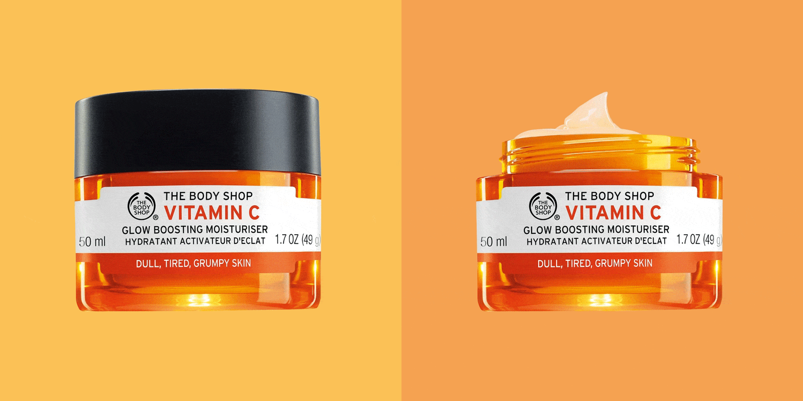
Bring the product right into focus, by blurring out the background entirely. Applications can do this, if your phone lacks the features. Here, The Body Shop did just that, completely blurring the background enabling the product to be the only thing attracting attention.
.@WWF launches Singapore alliance on sustainable #PalmOil I @ecobusinesscom RT @orangutans https://t.co/KSjSQne0me. pic.twitter.com/KAtRFqwbK1
— The Body Shop (@TheBodyShop) July 4, 2016
12. Seek Out a Sunset
Take advantage of the easiest source of light available to you; natural light. Different times of the day create different effects, so experiment with the natural light at different hours. A sunset can be a stunning backdrop for the product, as we can see here in this Tesla image; the light catches and enhances the curves of the car, and it’s a look that can be achieved with any product.
13. Alter the Exposure
You could also alter the exposure, brightening and flooding your image with stunning light. Some products just look brilliant in bright light, such as this diamond set piece by Chanel. Don’t worry. If you can’t manage to recreate this style of light, all you have to do is take a normal image and play with the exposure in an application.
Les Blés de CHANEL, a new High Jewelry Collection inspired by wheat, a symbol of luck. #BlesVendome #LesBlesdeChanel pic.twitter.com/xH6vAoYL9l
— CHANEL (@CHANEL) July 3, 2016
14. Make It Move
If you’re wanting an image with a difference, why not create a gif? These days, a gif is easy to make. Here is one by The Body Shop, made with popular gif creating platform giphy. Giphy allows you to make a gif, and not only that, you can also add in filters and effects. Movement attracts the eye, if you are after something a bit more, perhaps a gif is the choice for you?
15. Edit Your Work
The best images are edited images. Luckily, it’s easy to do right on your mobile device. Here are some apps to get to know, which are thankfully compatible with both Android and iOS.
Pixlr
One of the most popular and easy to use image editing apps is Pixlr. This app allows you to do virtually anything you please to your image, with an astounding number of combinations possible: two million. Most importantly, it’s a free app.
Fotor
Another free offering, Fotor is a popular photo editing app that creates exceptional images. The most recent version allows you to focus your images, giving your pictures a high definition, professional result.
PicLab HD
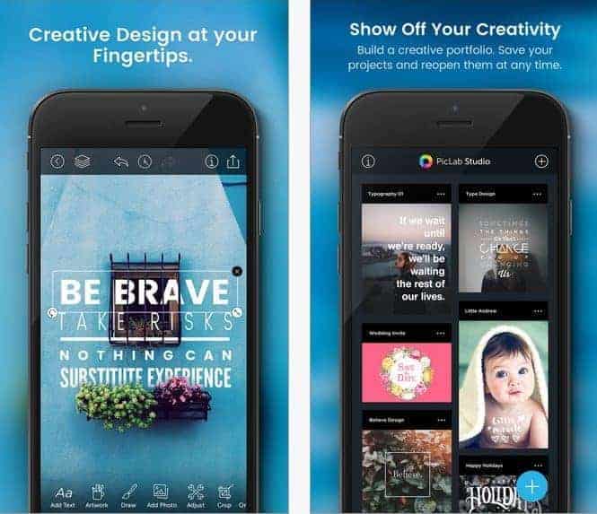
If you’re looking for an image editor that will allow you to overlay text, PicLab HD is the one for you. It doesn’t just offer text enhancement, it also offers the full range of editing tools enabling you to create beautiful, professional looking pictures. It’s not free, but it’s not expensive either. For those who have a need for text, this is the app to choose.
MavSocial
Our in-app photo editor comes with your MavSocial subscription and can not only help you perform basic edits like cropping and adjusting exposure and contrast, but can also apply social-ready filters. And you can use it for text overlays too.
16. Learn How to Use Your Phone’s Camera… or Upgrade!
The final recommendation is basic, but if your images aren’t looking great no matter what you try, then perhaps it is time to upgrade to a newer model. The ever-popular iPhone 6s boasts a camera that utilizes similar technology as traditional cameras, meaning you can shoot in low light and still capture excellent quality images, making it a great choice for creating social media images.
On the other hand, the LG G4 smartphone camera comes with a manual mode, making it a great choice for someone wanting to manually create content without the cost of a DSLR.
The current crop of smartphones is incredible for creating images for social media. If you rely on your phone to create your business images, then it is worthwhile to consider whether an upgrade is right for you.
Now that your images are next level, make them easy to share.


