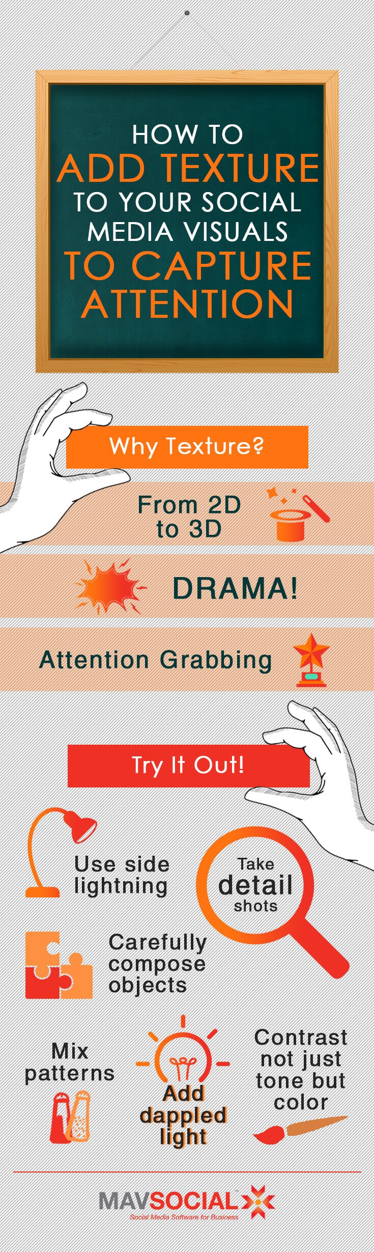
Adding lush texture to your social media images is a great strategy for capturing casual attention in visual news feeds
Nearly every social post could use a boost—that “it factor” that grabs your audience’s attention while they’re casually scrolling through their news feed. Social media photography can often benefit from the same tips as photography in general, and one pro technique is texture.
Created with contrast, curves, and patterns, texture is an element that many photographers set out to master, and you’ll want to use it catch casual attention that can convert into followers and leads.
Why does texture matter?
In one word: drama.
Texture gives dimension to social media images, transforming them from 2D into 3D (or as much as is possible).
Considering how important visual content is on social media, you just can’t ignore the concept. The best content marketers treat content like a product. So, if each photo is a product, it should be given the star treatment.
(Don’t overdo it)
Before we take a look at how to add texture to your social media visuals, let’s remember that we’re not trying to get overly artsy in our marketing campaigns.
You’re probably not attempting to make images that could be hung in a gallery, but rather to show your audience that you put thought and care into your visual content—and to get their eyeballs on your picture long enough to deliver that image’s message.
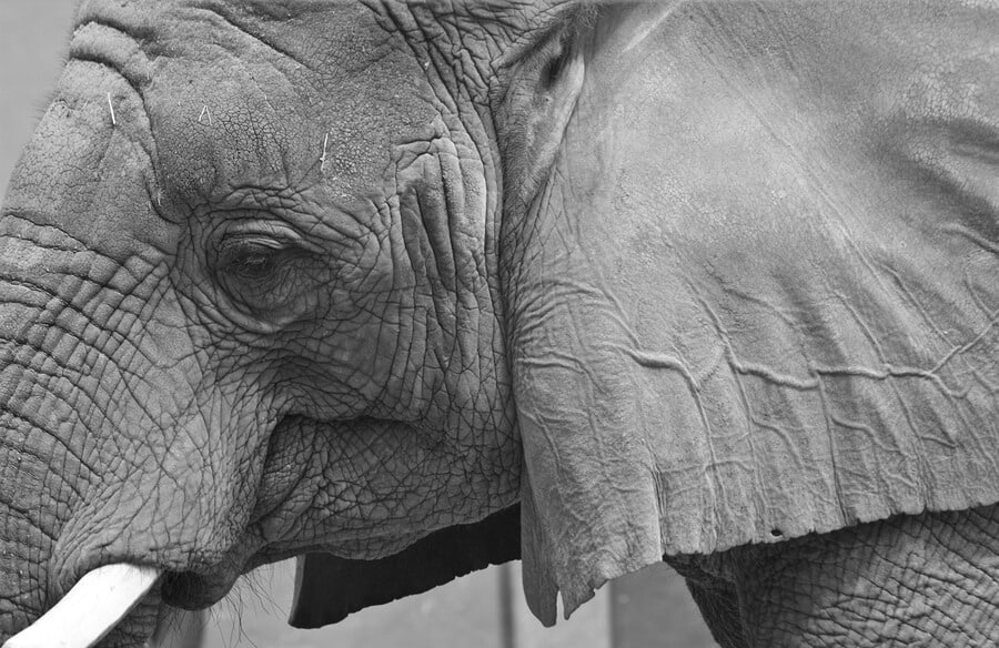
Most importantly, know that not every subject is the right choice for a textured shot. People, for example, can tend to look a lot more weathered and a whole lot less glamorous when treated with this technique. For marketers, that’s pretty much never the goal.
Unless you’re selling a body building product and want to show raw grittiness in human muscles, you probably don’t want to try this on the skin. Gorgeously wavy hair—well, that could work of course.
How to light your shots for better texture
The biggest tip is this: don’t try to use your camera’s flash for a shot that incorporates texture. You will end up with something flat. Why? The lighting will be coming from the front, and from the same source as the shot.
For truly texturized images, you need the lighting to come from a different source and a different angle, preferably from the side.
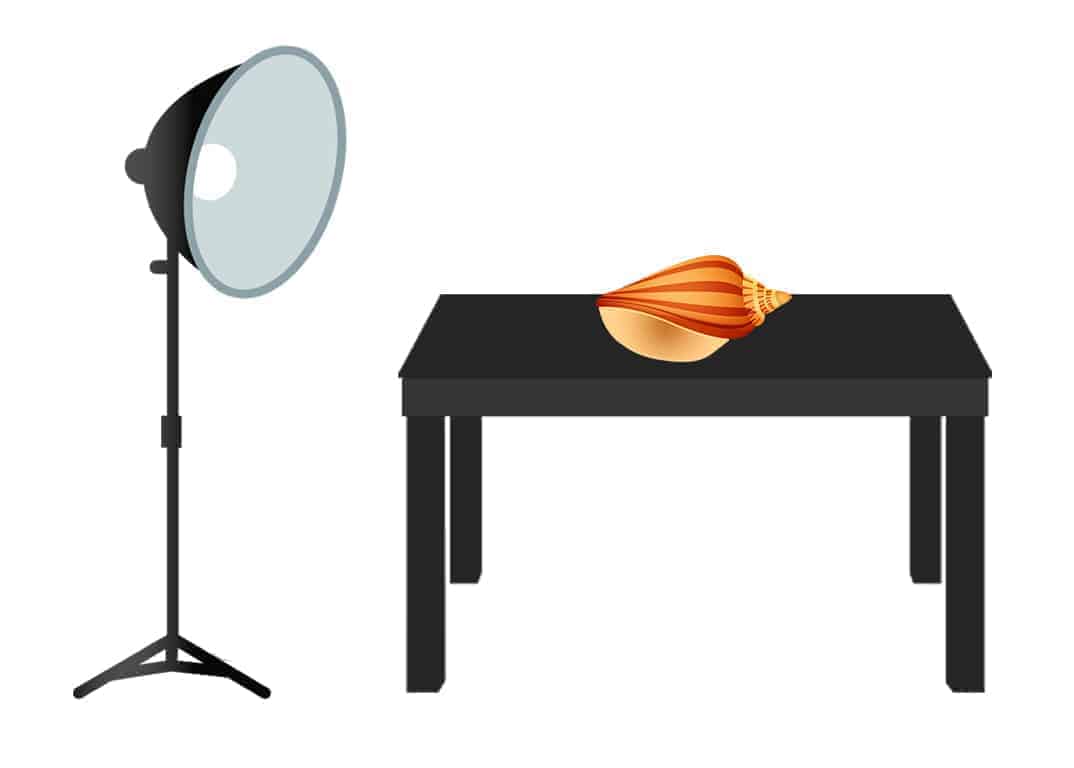
If you’re setting up a shot, you’ll do best placing the subject item on a table and then add your independent lighting source on the side. Then shoot from the front or overhead.
While straight-across side lighting is a classic texture technique, a few tweaks might keep you from creating the texture that looks too harsh. Take a few different shots to get options—try moving the lighting source back a little, or raising it higher so it hits at a ninety-degree angle.
Practice texture with a detail shot
Eventually, you’ll want to mix textures together (and flat elements with textured ones), but to start training your eye, try a detail shot.
Don’t worry about your content strategy at this point, just pick something with natural texture so you get a feel for what works with your equipment (whether your office is packing lighting equipment or you’re getting creative with your iPhone and desk lamp).

Potted plants, rugs and other materials, scattered seeds or beads—grab something mostly uniform and take a close up.
You can also practice outside with some clichéd options like tree bark and brick walls. Hey, it works.
Composition that means something
Now that you’ve got firsthand knowledge of the transformative nature of texture (seriously—just switching up the lighting is like whoa), you can start strategizing how to add this element to the social visuals for your brand.
Here are some rules:
- Textured elements should never compete with one another
- Texture should never take focus away from the main focal point
- The texture that you enhance should be appealing to your audience
If you work in a non-visual vertical, simply add texture to the visual ideas you’re already producing. So, if you take desktop and office space shots, bring in a textured element that will communicate a soothing or exciting emotional response in your audience.
But if you need to take product pics, be careful. You might not want to texturize the actual product, depending on what it is. If you sell anything flat, from books to laser cut earrings, bring in textured elements to photograph next to your product.
You can watch how the lighting is hitting the product relative to the textured item.
Incorporate leading lines and patterns
Leading lines tell your eye where to look (exactly) on a picture. A key element of texture is the curve. Leading lines add to the effectiveness of texture by forcing the eye to take notice.
So of course, you’ll want to be smart about how you place objects. This is why it’s good to test your composition. Take a few shots, and then step back with a critical eye. Are the curves and lines taking the eye towards the textured element or competing with it?
For a true win, you’ll want leading lines that point to your product.
Patterns are another element to play with. While a detail shot will likely have a uniform pattern (think tree bark), a wider shot can break patterns or mix them. Time to experiment!
Letting light be the subject
Any good photographer will tell you that light can be a texture—and the subject of a photo. Choosing light as the subject is good for humanizing your brand’s social feed and conveying an emotion that represents your brand.
While ambient lighting will allow the objects in the photo to stand out, dappled lighting will take over, creating its own pattern. So choose this technique wisely. It can be great for communicating brand messaging, encouraging quotes, or portfolio items.
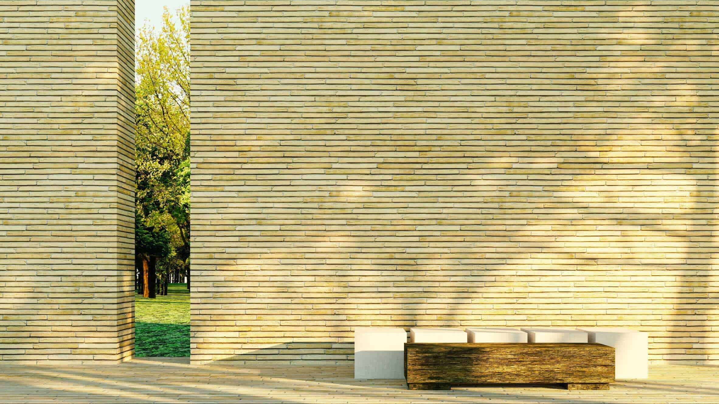
This photo has leading lines, a pattern, and dappled light but still has a clean and simple feel.
Up the contrast for more texture
The classic way to do this would be a black and white high contrast image of fur or sand, or anything else textured. But that sort of image would be far too stark for most brands. Contrast doesn’t have to be so obvious.
Texture can also be created by having the focal point a different color than the background, or playing with the background in general.
In any case, contrast—whether soft and subtle or harsh and glaring—is one of the easiest ways to bring out the texture.
If you’re playing around with old, flat photos and trying to make them come alive, try upping the contrast in your favorite editing tool. But for the most part, you’ll want to think about texture before you take the shot.
Now that you know all the best tricks for creating texture—a key element in visuals that rule social feeds—start experimenting with your own social media images.
MavSocial let’s you pre-schedule your Instagram content from one central social media platform. Sign up for a free 14-day trial of Pro to get started.