Gain more followers with a cohesive color palette for your Instagram feed
What’s the goal for Instagram marketing? Getting on the same level as your audience, communicating, telling stories, and inspiring real engagement.
To get your potential new audience to click “Follow” in the first place, you have to catch their attention.
Even if your photos look brilliant when viewed individually, they could be a jumbled mess when seen together.
Your Instagram feed has to make sense. People aren’t going to follow you if they have no idea what to expect. If they enjoy the style and voice of your account, they won’t worry about each individual post. But if every post has a different tone, then that person might like a few photos and then navigate away.
Not every big brand gets this. Plenty of major global brands have cluttered, overwhelming feeds, and relatively low follower amounts.
Here, we’re covering the brands and influencers doing color right and the one-photo trick for developing your own Instagram color palette.
Instagram Color Palettes To Aspire To
Focus on Tone
Despite selling a multitude of products for different sports throughout all seasons, REI manages to maintain a consistent Instagram channel.
Their content is very warm, featuring sand, rock, and desert tones in well over half of the shots.
Even in colder seasons and greener months, they manage to bring in some images with those warm desert tones by shooting sunsets and sunrises.
It’s not about having everything match, it’s about giving your audience something to expect. In REI’s case, followers know that they’ll be served up exciting images with an inviting tone.
Pick a Subject
Travel site Le Postcard’s Instagram account has a very clear color palette—white sand neutrals and bright aquamarines, making good use of the complimentary colors blue and orange.
How is this possible? Well, the entire feed is drool-worthy cocktails and ice cream, gorgeous beaches, and flowy resort wear.
If the consistent subject matter can work for the purpose of your feed, then run with it.
Switch Things Up
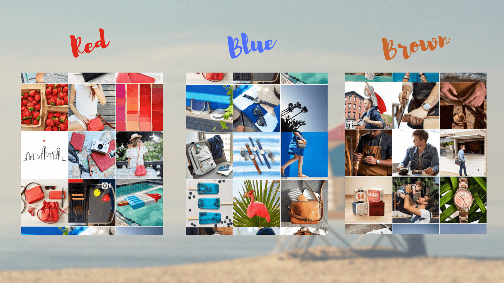
Fossil knows how to stay consistent for just long enough. Every nine to twelve images, Fossil has a new color in the spotlight.
This allows them to market for mass appeal during certain seasons and holidays, while still curating a feed that appears thought-out and visually appealing.
This option could be great for your channel if you can’t possibly pick one color scheme at a time. But don’t think that switching your colors means you can switch your style. You’ll still want to be consistent with your composition.
Where to Go for Color Palette Inspiration
If your brand can logically stick to one color palette (instead of switching), then you should try.
One of the best places you can go on the internet if you LOVE color is Design-Seeds.com. Designer Jessica Colaluca creates THE most beautiful, inspiring color palettes every single day.
You could search through her years of creations to find a color palette that will go with your brand and satisfy your audience, or you could take her idea of creating a color palette from a single image. Then you can allow that palette to guide 70-90% of the images in your feed.
Why not 100%? You need to have variation outside of your palette, so long as it is completely complimentary. Otherwise, your feed might become stale and robotic.
Which type of color palette to choose
To help you know what to aim for, let’s review some of the easiest color palettes to work with for branding purposes.
You want something that will not be off-putting or confusing, so we’re leaving out triad color palettes, among other tricky versions.
Here are the types you want to aim for when it comes to Instagram color palettes:
Analogous Color Palettes
All the name means is this: the colors are next to each other on the color chart. If you prefer a strictly warm or strictly cool look in the rest of your branding efforts, then this palette is all you.
View this post on Instagram
Monochromatic Color Scheme Palettes
If your brand is strongly associated with a single color, then monochromatic color palettes can give you an opportunity to expand on the meaning and association of that single color by employing additional tones in your feed.
View this post on Instagram
Complimentary Color Palettes
These color palettes tend to feel a little more creative, as they pull together seemingly disparate colors (that are opposite each other).
View this post on Instagram
Neutral Color Palettes
Not a “type” of color palette per se, neutral color palettes are worth mentioning here because they can perform very well on Instagram. If this is a fit for your brand, definitely go for it.
These color palettes allow for a “pop” factor when you bring invariably colored elements to your feed.
View this post on Instagram
Being Consistent Even with New Colors
Look at all that color! Would you believe that the Design Seeds feed manages to maintain consistently? Well, it actually does.
Jessica Colaluca brings a similar feel to her images by creating consistency in areas other than color. She includes 6 shades in every palette and maintains equal size and spacing for each shade. She always puts the palette on the bottom or on the right of each photo.
With well-composed photos and white borders, the photos and palettes themselves have a lightness and airiness to them even when dark, bold, or bright colors are involved.
Consistency matters so much when it comes to building an audience!
Similar to REI, Design Seeds tends to skew towards brights or naturals for nine to twelve posts. So you have no excuse to not aim for some form of consistency. The key is to pick something that is restrictive but doable for your brand.
Now that you’ve seen the goal, let’s create a color palette for Instagram from scratch and follow through.
Color that means something
Before you proceed much further, you need to put your head down, forget the inspiration sources, and think about YOUR brand. What are you trying to communicate and to whom? Of course, this gets clearer over time, but you have to have a starting point.
If your brand is successful in other social channels, then be sure to learn about who your audience is on those networks. Knowing who responds to the brand can help you decide who to target.
No matter who you try to target—male, female, young, or old—recognize that emotive, inspiring colors and images do well on Instagram.
Tools for creating a color palette from scratch
Adobe Color
With Adobe Color ‘s color wheel, you can browse thousands of color combinations from the Color community and make adjustments in the color wheel.
- Analogous Colors
- Monochromatic Colors
- Triad Colors
- Complimentary Colors
- Compound Colors
- Shades
- Custom
Remember that not all of these are easy options for branding! So be sure to create something that will invite users into to your social feed—not dispel them.
If you’re afraid that a monochromatic color palette won’t work for Instagram, don’t be! Remember that you can still throw in pops of other colors or complementary color variants.
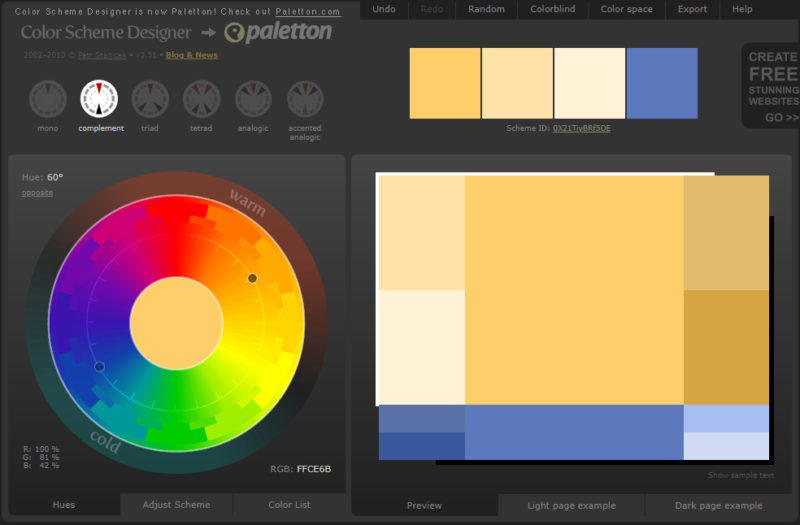
Color Scheme Designer
Color Scheme Designer can feel a little trickier to use. It has a couple of great features, like adjusting saturation and contrast, which will allow you to pick a color scheme that is close to the emotional feel that you’re going for.
The one-photo trick: how to create a color palette from an image
How do you pick that one photo that will rule your feed? Ideas for images that will guide your color palette:
- Your best product shot
- Your Instagram photo with the most engagement
- Custom imagery from your website
Of course, any picture you use does not have to contain your brand colors but should go well with your brand colors.
If you embed your Instagram feed on your website, it should make sense with your web color scheme.
Generating a palette
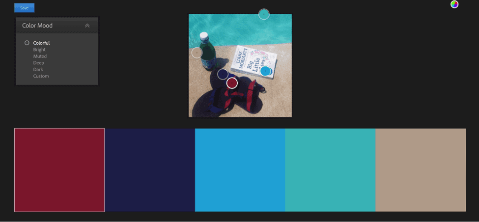
If you want to automate a palette from a specific image, you can always upload that photo into Adobe Color, or another program that allows you to create a color palette from an image, and see what you come up with.
Even if you are using a color generator tool, you should still have an idea of what you are looking for. The color generator isn’t going to create exactly what you want. Before you upload the photo, know what you are trying to capture. Then translate that into a specific aim for the colors.
- Bright
- Muted
- Dark
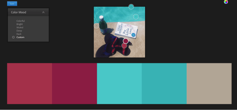
For this photo, bright and neutral tones will be the best. The Fuschia, turquoise, and neutral will create a beautiful palette.
As you can see, the color generator picked up some additional, unwanted tones too.
The warm colors are just too dark, and while they do capture the colors of the photo, they aren’t the goals of the entire Instagram feed.
In the top right corner, you can select bright, muted, and dark to see newly generated options, but if it’s still not what you’re after, you’ll likely have to tweak it yourself by hand.
Even if you aren’t a designer, the human eye is still far more effective than a machine. A color picker tool like this can give you a great place to start for creating the swatches that will serve as your inspiration.
Customizing the palette
Moving the color pickers around creates a palette with the accent colors in the photo.
You can then save it and tweak it even further.
It’s still not bright enough or representative of the summery spirit of the photo. You can keep tweaking it, but it’s wise to save a copy inside Adobe Kuler so you have all of the other versions if you find that you’ve tweaked it a little too far.
Saving Your Color Palette
Not only should you save the color palette in Adobe Kuler, but you should also try some fun, creative ways to keep the palette for further inspiration.
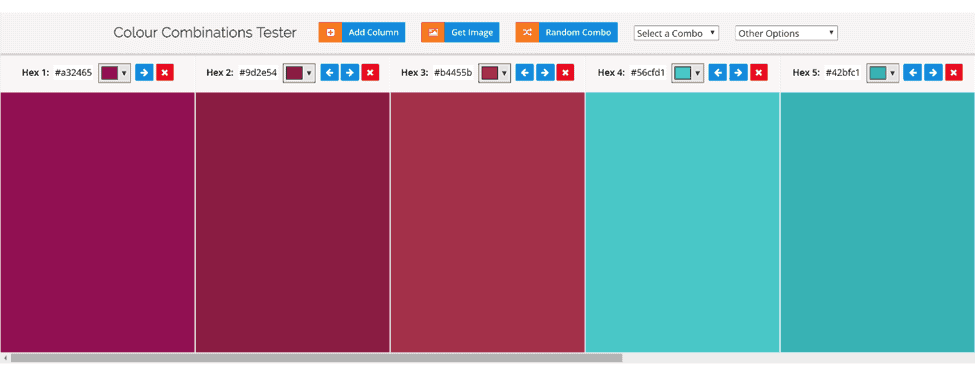
One of the best ways to save a palette is with the Color Combos Tester.
This tool will generate a downloadable image of your palette. Before you download, you can also experiment with adding some colors and taking other colors away.
All you have to do to get started is to copy the hex codes over.
Next, you can create a PNG to download.
All of the colors that you choose can be turned into a row of balloons, paint can, pencils, you name it (there are a dozen options). Of course, you can always keep things simple and go with squares.
It’s a good idea to download the squares for easy referencing. But the pencils might spark a little creativity!
The PNG will save to your computer with the names of the hex codes in order—so be sure not to rename it (unless you save the codes somewhere else too).
Apply Filters to Your Palette
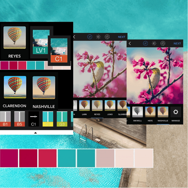
How will you know what filters will work for your new scheme? Easy—just try filtering over the color palette that you’ve just downloaded.
Of course, the images you upload to Instagram will be very different than squares of color, but it is worthwhile to see the effect of different filters on the colors you’ve chosen.
This way, you can start to see how a few different filters can add up to a unified Instagram feed. If you have a bright image, you might need to tone it down a bit. If you have a muted image, you might want to liven it. Think of your color palette as the middle ground.
So use your favorite apps for filtration on your color palette and see what happens. The photo that served as inspiration for this palette was created with the VSCO filter LV1.
By experimenting with the palette colors inside of VSCO, it’s clear that the C1 filter could be a great option for this scheme as well.
Before

After
By applying the VSCO C1 theme, the entire palette, it was brightened up a bit, showing a look that actually captures the summery spirit of the photo much better.
You can also bring your color palette inside Instagram to see how it responds to different filtering options.
Create an Instagram color palette vision board
The next thing you’ll want to do is create an Instagram color palette vision board. This can be a Word Document, a Canva design—whatever you want to do that will get your inspiration in one place.
Include:
- some of your existing photos that fit the scheme
- photos that your company aspires to create
- the PNG of the color scheme that you’ve chosen
- your company logo
- important elements from your website
- the filters that you’ve chosen
- a pop element (what a secondary color might be)
Include 3-5 filters with different styles. You don’t want to be completely monotonous. Remember that not every filter will give you the desired effect for every photo. You need a few options you can turn to in order to bring out the colors that you really want.
It’s okay to have bright and muted options, especially if your color palette is tight.
Or Add the Instagram Color Palette to Your Brand Guidelines
While a vision board is fun to keep one person’s efforts on track—to inspire a small business owner or solopreneur—many businesses need more concrete guidelines.
If a vision board is so not your company’s thing, you can create Instagram-specific brand guidelines. Here are some options:
- Create an Instagram slide in your overall brand guidelines
- Create an Instagram slide in your social or online content guidelines
- Create an entire slide presentation for Instagram
Whatever you do, you’ll want to include these things when it comes to your new color palette:
- Unique names for each color
- Descriptive adjectives for the mood of the palette
- Hex codes for each color (just in case)
- Text overlay colors
- Names of filters that are ok to use, and what app they came from
Now you can start posting photos with more consistency. Instead of just earning likes on random images, you’ll capture the exact audience that you want for your channel.
Go forth and conquer Instagram beautifully!
